

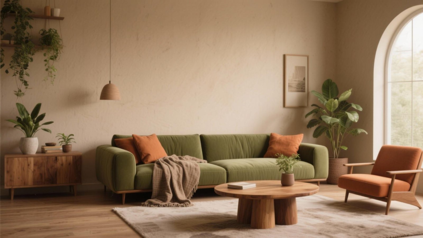
Best Living Room Color Combinations for a Warm and Modern Look
The right living room colors can make a space feel welcoming, balanced, and stylish without requiring expensive furniture or a complete renovation. The secret is choosing shades that work together across your walls, sofa, curtains, rugs, and decorative accessories.
The best living room color combinations often balance a comfortable base color with one or two complementary shades. Cream and olive green create a natural look, beige and charcoal add modern contrast, while terracotta and warm white bring an earthy character to the room.
Your room’s natural light, existing furniture, and personal style also matter. A combination that looks beautiful in a bright showroom may appear different in a room with limited daylight.
Below are 10 living room color combinations, with practical advice on where to use each shade and how to create a cohesive look.
1. Cream and Olive Green for a Natural, Modern Living Room

Cream and olive green make a balanced combination for anyone who wants a relaxed living room with a contemporary feel. Cream provides a soft, neutral background, while olive green introduces depth and a connection to nature.
This pairing works particularly well with wooden furniture, woven baskets, linen curtains, and simple decorative accessories.
How to use this combination:
- Paint the walls a creamy off-white.
- Choose olive-green cushions, an accent chair, or a sofa.
- Add natural wood through the coffee table or shelving.
- Use a beige or cream rug to connect the different elements.
- Introduce small black or bronze details for contrast.
If you already own a neutral sofa, you can try this palette without replacing it. Start with olive cushions, a throw, or artwork featuring green tones.
Best for: Modern, organic, Scandinavian-inspired, and minimalist interiors.
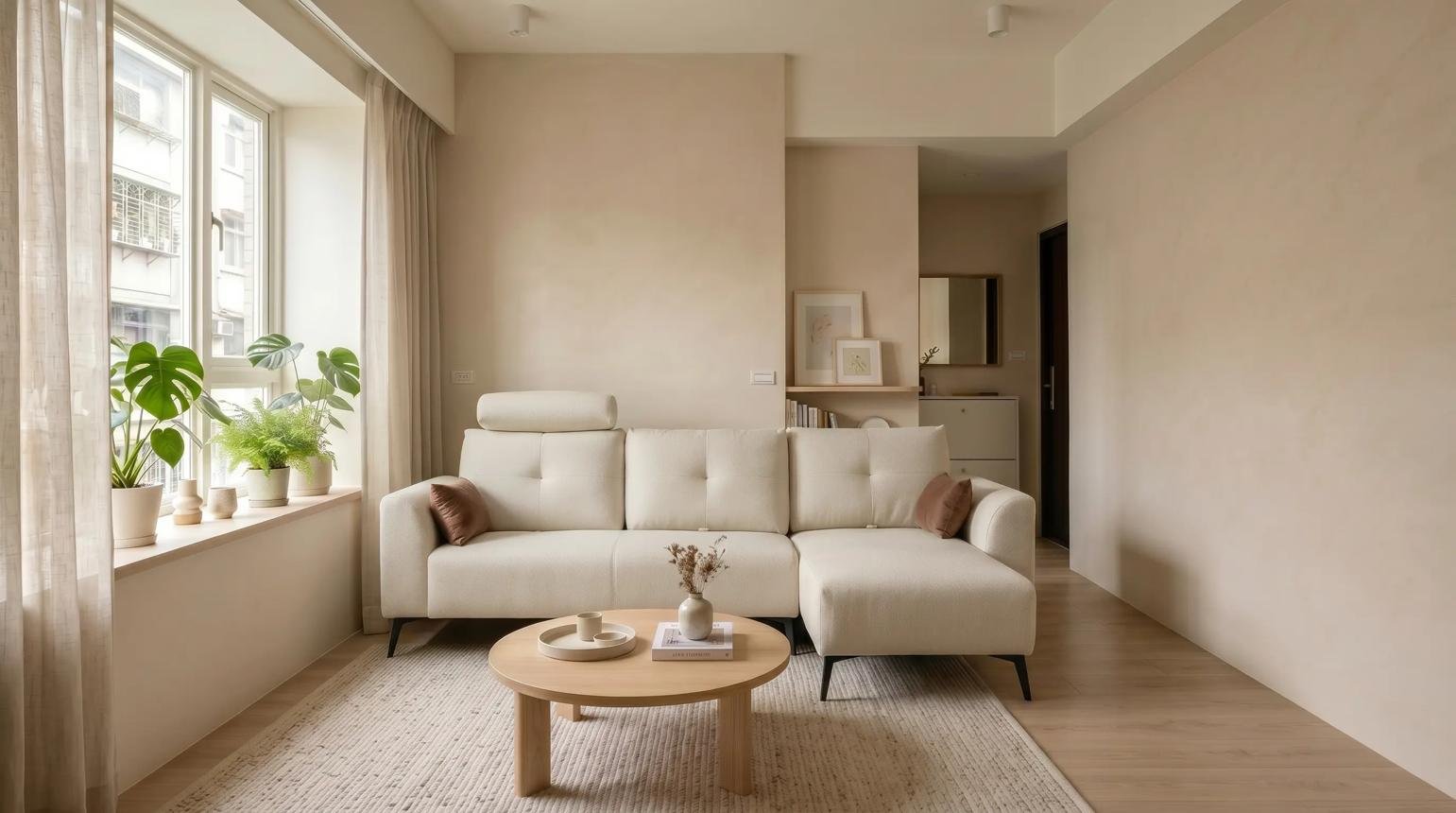
2. Beige and White for a Timeless Warm Neutral Palette

Beige and white create a bright, understated living room that feels coordinated without relying on bold colors. The key is to choose whites with suitable undertones rather than combining shades that look noticeably mismatched.
Warm white and sandy beige generally work well together when you want a soft, inviting appearance. Different textures help prevent the room from looking flat.
For example, combine warm-white walls with a beige sofa, a textured ivory rug, and light wooden furniture. Add linen curtains and a few cushions in slightly deeper shades of tan.
How to keep neutral colors interesting
Use variation in texture and tone rather than adding many unrelated colors. A knitted throw, a woven rug, a smooth wooden table, and softly textured cushions can give the room depth.
Best for: Small living rooms, rental homes, apartments, and interiors that need a flexible background for changing accessories.
3. Terracotta and Warm White for an Earthy Look
Terracotta brings a warm, earthy character to a living room. Inspired by clay and natural earth tones, it pairs well with warm white, cream, sand, and wood finishes.
You can use terracotta as a main accent color or keep it subtle through cushions, pottery, artwork, and decorative fabrics.
For a restrained modern look, keep most walls warm white and introduce terracotta through a single accent wall or a few coordinated accessories. If you prefer a richer atmosphere, combine a deeper clay shade with cream upholstery and medium-toned wood.
Avoid adding too many competing warm shades at once. Terracotta, mustard, orange, and deep red can become visually busy if each occupies a large area.
Best for: Earthy modern, Mediterranean-inspired, and contemporary rustic living rooms.
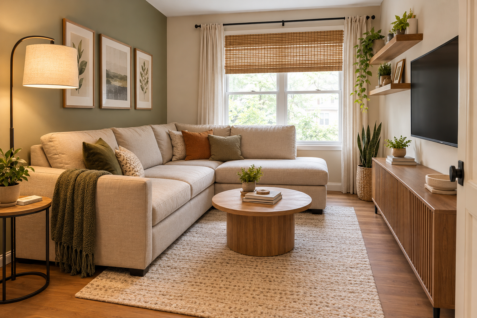
4. Sage Green and Beige for a Soft, Relaxed Atmosphere

Sage green is a muted green with a soft, often grayish appearance. When paired with beige, it creates a gentle color scheme that feels fresh without being overly bright.
This combination is especially useful if you want color but do not want the room to feel dominated by a strong shade.
Try sage-green walls with a beige sofa, or reverse the arrangement by keeping the walls neutral and introducing sage through upholstery, cushions, or curtains.
Natural wood, cream fabrics, and simple ceramic accessories help the colors feel connected.
Best for: Calm contemporary interiors, nature-inspired spaces, and living rooms that need a subtle alternative to all-neutral decorating.
5. Charcoal Gray and Cream for Modern Contrast

Charcoal gray and cream create a stronger contrast than beige and white. Cream softens the darker shade, while charcoal adds definition to the room.
The combination works well when the darker color is used thoughtfully. For example, you might paint one wall charcoal, choose cream seating, and add a dark metal lamp or picture frame.
In a small or dim living room, consider using charcoal in smaller amounts rather than covering every wall. A charcoal rug, cushions, or media unit can introduce contrast while keeping most of the room light.
Best for: Contemporary apartments, minimalist interiors, and rooms that benefit from a defined focal point.
6. Navy Blue and Warm Beige for an Elegant Look

Navy blue provides depth, while warm beige prevents the palette from feeling too cool. Together, they create a polished combination that can suit both modern and traditional furniture.
A navy sofa can become the main feature against beige walls. Alternatively, keep the sofa neutral and introduce navy through curtains, cushions, or artwork.
Brushed brass details, warm wood, and cream textiles can complement this pairing. Use metallic accents sparingly so they support the palette rather than compete with it.
If you are choosing navy paint for a small room, test the shade in the actual lighting before painting an entire wall. Deep colors can look quite different throughout the day.
Best for: Elegant contemporary living rooms, classic-modern interiors, and homes that need a deeper accent color.
7. Warm Gray and Natural Wood for Understated Style

Gray can look warm or cool depending on its undertones. A warm gray paired with natural wood creates a balanced interior that feels modern without appearing overly stark.
Choose a gray with subtle beige or brown undertones if your goal is warmth. Pair it with oak, walnut, or other wood finishes that complement the gray rather than clash with it.
For example, use warm-gray walls, a cream or greige sofa, a wooden coffee table, and ivory curtains. A few black accents can give the arrangement a sharper finish.
If the room already contains cool gray flooring or furniture, compare paint samples carefully before choosing another gray. Different undertones can look inconsistent when placed next to each other.
Best for: Modern family rooms, neutral interiors, and homes with existing gray furniture.
8. Rust and Olive Green for a Rich Earthy Palette

Rust and olive green combine two earthy shades with distinct personalities. Rust adds warmth, while olive provides a grounded green accent.
Because both colors have considerable visual character, it is usually easier to choose one as the dominant shade and use the other in smaller amounts.
For instance, a cream sofa can serve as a neutral base with olive cushions and rust-colored artwork. Alternatively, an olive-green sofa can be paired with rust cushions and a light neutral rug.
Natural wood, cream upholstery, and simple patterns help the palette remain cohesive.
Best for: Eclectic modern interiors, earthy decorating styles, and living rooms that need more color than a neutral palette provides.
9. Dusty Blue and Cream for a Fresh, Soft Modern Look

Dusty blue offers a softer alternative to navy. Its muted appearance pairs well with cream, pale beige, and light wood, creating a room that feels fresh and understated.
Use dusty blue on a feature wall, an accent chair, or the curtains. Cream upholstery and natural wood help balance the cooler tone.
This combination can be particularly useful when you want a modern room without strong black accents or saturated colors.
If your living room receives cool or limited daylight, test the blue carefully. Some shades may appear grayer or colder than expected.
Best for: Contemporary apartments, relaxed minimalist rooms, and living spaces with light neutral furniture.
10. Chocolate Brown and Soft White for a Cozy Modern Interior

Chocolate brown adds richness and visual weight, while soft white keeps the room from feeling too heavy. The combination works particularly well with wood furniture, textured fabrics, and warm lighting.
You can introduce brown through a sofa, leather chair, curtains, or wooden furniture. If the room is small, use soft white on most walls and reserve the deeper brown for selected elements.
A cream rug, pale cushions, and a few simple accessories can bridge the two colors.
Best for: Cozy modern interiors, warm minimalist rooms, and living rooms that use natural wood or brown upholstery.
11. Quick Comparison: Which Color Combination Should You Choose?
Use this table to narrow your options based on the atmosphere you want to create.
| Color combination | Overall look | A practical way to use it |
|---|---|---|
| Cream + olive green | Natural and modern | Cream walls, olive cushions or sofa |
| Beige + warm white | Bright and timeless | Beige upholstery, warm-white walls |
| Terracotta + warm white | Earthy and expressive | Terracotta accents with neutral walls |
| Sage green + beige | Soft and relaxed | Sage walls with beige furniture |
| Charcoal + cream | Bold and contemporary | Charcoal accent wall, cream seating |
| Navy + beige | Elegant and defined | Navy sofa with beige walls |
| Warm gray + wood | Understated and balanced | Warm-gray walls with oak furniture |
| Rust + olive green | Rich and earthy | Neutral base with rust and olive accents |
| Dusty blue + cream | Fresh and gentle | Dusty-blue accents with cream upholstery |
| Chocolate brown + soft white | Cozy and grounded | Brown furniture against light walls |
These are starting points, not strict rules. The best choice depends on the furniture, lighting, room size, and colors you already have.
12. How to Choose the Right Color Combination for Your Living Room
A color palette should suit the actual room rather than simply look attractive in an inspiration photograph. Before buying paint or replacing accessories, consider these factors.
Start with furniture you already own
If you have a sofa, rug, or curtains you plan to keep, use those items as the starting point for the palette.
Identify their main colors and undertones. A beige sofa may lean yellow, pink, gray, or brown, and that subtle difference can affect which wall colors look coordinated beside it.
Choose two or three colors that work with the existing pieces before adding anything new.
Consider natural and artificial lighting
Light changes how paint and fabric colors appear. A shade that looks warm in daylight may seem cooler under artificial lighting.
The direction your windows face and the amount of daylight the room receives can also affect your choice. Warm neutrals are one option for rooms that feel cool or dim, while stronger contrast may work well in a brighter room. Test samples before committing.
Decide how much contrast you want
If you prefer a calm, cohesive room, choose neighboring shades such as cream, beige, and warm gray.
If you want a more defined look, combine a neutral base with a stronger accent such as olive, navy, charcoal, or terracotta.
You do not need equal amounts of every color. Keeping one shade dominant and using the others selectively can make the room easier to coordinate.
Match colors to the room’s proportions
Lighter colors can help a room feel visually open, while darker shades can create depth and a more intimate atmosphere. Neither is automatically right or wrong for a small room.
If you love dark green or charcoal but have limited natural light, try using the shade on one wall or through furniture and accessories instead of covering the entire room.
Test paint before committing
Paint a sample on a board or a suitable section of the wall and observe it in daylight and evening light. Compare it with the sofa fabric, flooring, curtains, and other finishes.
Do not select a color from a small digital swatch alone. Screen settings and lighting can make the same shade appear different. Paint manufacturers also note that on-screen color representations may vary from the actual paint.
13. How to Use Color Across Walls, Furniture, and Accessories
Even a beautiful color combination can look disjointed if every element competes for attention. Give each color a clear role.
Use the wall color as the foundation
Walls cover a large area, so their color strongly influences the room’s overall appearance. Cream, warm white, beige, and soft greige can provide a flexible background for a wide range of furniture styles.
If you prefer a more colorful room, sage green, dusty blue, or terracotta can also work as wall colors when chosen to suit the room’s light and existing finishes.
Choose one dominant furniture color
A sofa often occupies a large visual area. If it is already a strong color, let the walls and larger accessories support it rather than introducing several competing shades.
For a neutral sofa, cushions, throws, or an accent chair offer an easy way to experiment with a new palette.
Repeat accent colors thoughtfully
Repeat an accent color in two or three places to connect the room. For example, terracotta cushions can relate to a piece of artwork or a ceramic accessory.
The repeated color does not need to match exactly. Similar tones and related textures can create a coordinated effect without making the room look overly planned.
Add texture for depth
Color is only one part of a successful interior. Wood grain, woven fabrics, linen, wool, ceramics, and metal finishes can make a simple palette feel more layered.
A beige-and-white room, for example, can gain character through a textured rug, linen curtains, and a wooden coffee table without needing additional colors.
14. Common Living Room Color Mistakes to Avoid
A few avoidable choices can make a carefully selected palette less successful.
- Choosing paint before considering existing furniture: The wall color may clash with the sofa, flooring, or curtains.
- Ignoring undertones: Two colors described as beige or gray may still look noticeably different together.
- Using too many accent colors: Several strong shades can compete instead of creating a unified appearance.
- Relying only on photographs: Images may be edited, and screen colors may not accurately represent real paint.
- Forgetting the lighting: A shade can appear different in morning daylight, afternoon sunlight, and evening lamp light.
- Assuming dark colors never work in small rooms: Deep shades can be effective when balanced with lighting, lighter surfaces, and the room’s proportions.
- Replacing everything at once: You may be able to create a new look by changing a few accessories and keeping the main furniture.
The most practical approach is to choose a palette, test it in the room, and make changes gradually.
11. Frequently Asked Questions
What are the best living room color combinations for a warm and modern look?
Cream and olive green, beige and warm white, terracotta and cream, sage green and beige, and warm gray with natural wood are useful starting points. Choose the combination that complements your furniture, lighting, and preferred style.
Which colors make a living room look warm and inviting?
Warm white, cream, beige, taupe, terracotta, rust, and chocolate brown can help create a warm appearance. Natural wood and textured fabrics can reinforce that effect. The result depends on the specific shades and lighting.
What are the best two-color combinations for living room walls?
Cream and beige offer a subtle look, while warm white and sage green provide a gentle contrast. Terracotta and cream create a more expressive palette, and charcoal and soft white provide a sharper modern appearance.
Which living room colors work well with beige furniture?
Beige furniture can pair with cream, warm white, olive green, sage green, terracotta, navy, and warm gray. Check the beige furniture’s undertone before selecting wall paint, as some shades lean pink, yellow, or gray.
How can I make a small living room feel warm without making it look crowded?
Use a coordinated palette with a light or medium-toned base, introduce one or two accent colors, and add warmth through wood and fabric textures. You can also use a darker shade in smaller areas rather than covering every surface.
Should living room walls and furniture be the same color?
No. Matching every major surface is not necessary. Related shades can create a subtle tonal look, while contrasting walls and furniture can add definition. A balanced combination usually allows one or two elements to stand out without competing for attention.
12. Conclusion
The best living room color combinations bring together warmth, contrast, and the features already present in your home. Cream and olive green create a natural modern look, terracotta and warm white add earthy character, while beige and white provide a flexible foundation.
Before choosing paint, consider your furniture, natural light, room proportions, and the atmosphere you want to create. Test colors in the actual space and use cushions, curtains, rugs, or artwork to introduce accents gradually.
A thoughtful palette does not need to include many colors or expensive new furniture. Start with a few compatible shades and build a room that feels cohesive, comfortable, and personal.

Leave a Reply